Recreating my website with Gatsby
I made my old website about a year ago around this time as well. I was actively looking for an internship for the summer. I really enjoy web and web design, but I have difficulty trying to come up with something that satisfies my eye. I would not call myself a perfectionist in most regards, but maybe in this one case I do often find myself spending a large amount of time tackling the smallest of pixels of alignment. I tried to look at other personal website for ideas and inspiration, but I found that it did not help in terms of guidance (I guess the end product hides all the process). At some point it all came down to just starting.
The first try

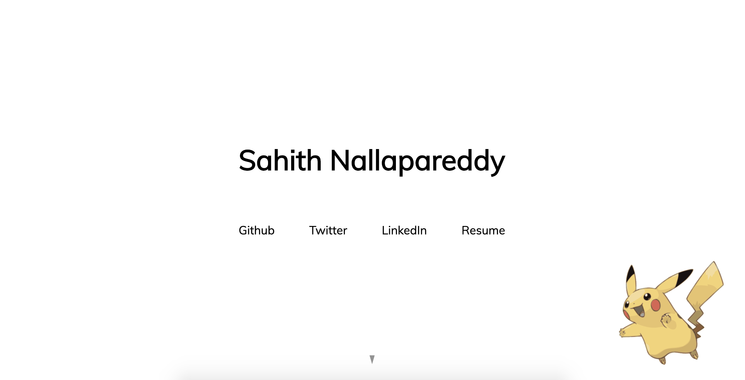
The things I liked about this site was that it was simple. It had all the information that I wanted to show right there. Yes it took me about an hour to pick a font (decisions are hard), but I think it was a good start. The pikachu was added to have some color on the screen. I really like the animation that draws SVG as I have used that in a lot of my own animations so that is what I went with there. I thought it would be a good idea to have more info on things I had fun making further down the page, but looking back I miss the idea of just having 4 links and a charged pikachu.
The second try
Well, you are looking at it. Firstly, what I wanted in this attempt a year later was to learn something. The previous attempt I did using static html and css, which was perfectly justified. There was no reason to use any fancy tools when everything I wanted could be done with the DOM. Now, well I wanted to document my journey in the upcoming years so I thought keeping up posts of things I wanted could be fun. That is why I chose Gatsby to create this. I saw on my timeline that it was popular, and people really recommended it for many reasons, one being that it was fast. I never used GraphQL before so I thought it was worth giving it a shot.
The Great Gatsby
Not going to lie I never read that book lol, I only saw the movie and that too I think a small part of it. My experience with Gatsby was fantastic. The documentation is incredibly thorough, and the tutorial does a great job of finding the line between allowing you to learn the concept and still being easy to follow. I find that a lot of tutorials can end up just copy and pasting code. Therefore, it was refreshing to find Gatsby nailing it. It was extremely easy to use with little learning curve (well I did have a lot of experience with React so that probably helps). GraphQL was easy to pick up especially when the use case was common and simple. In a short amount of time, I had everything setup. I had to get over some mental blocks to try to think of some sort of design, which lead to my first failed attempt.
I guess big SVG can be a problem
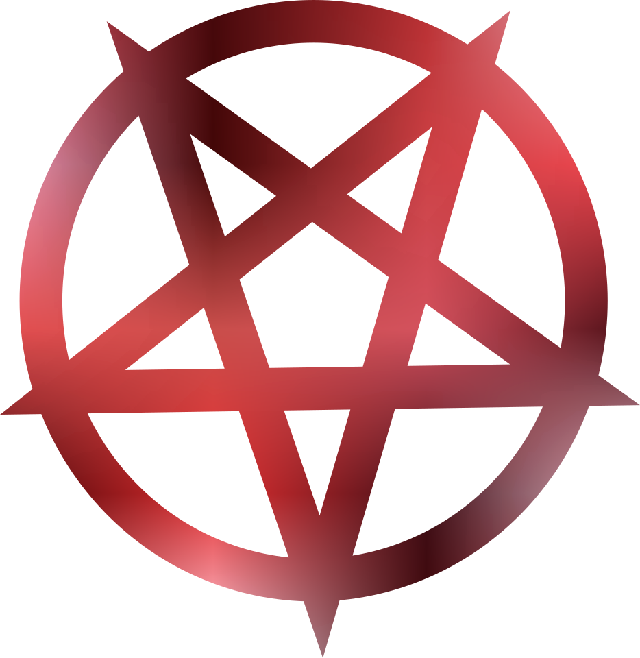
My first idea was to have a similar approach to the first website, but this time I wanted to showcase more animations. So I went through the effort to pick a couple of svg animations I made. I put in the effort to try to create a new one out of Playboi Carti's Whole Lotta Red logo (drop the album please). I do not want this to go to waste so here is what the svg looked like at least:

However, I coded something that looked like this
  switch (image) {
    case "mbdtf":
      return <MBDTF />
    case "pikachu":
      return <Pikachu />
    case "flower":
      return <Flower />
    case "wlr":
      return <WLR />
    default:
      return <Pikachu />
  }
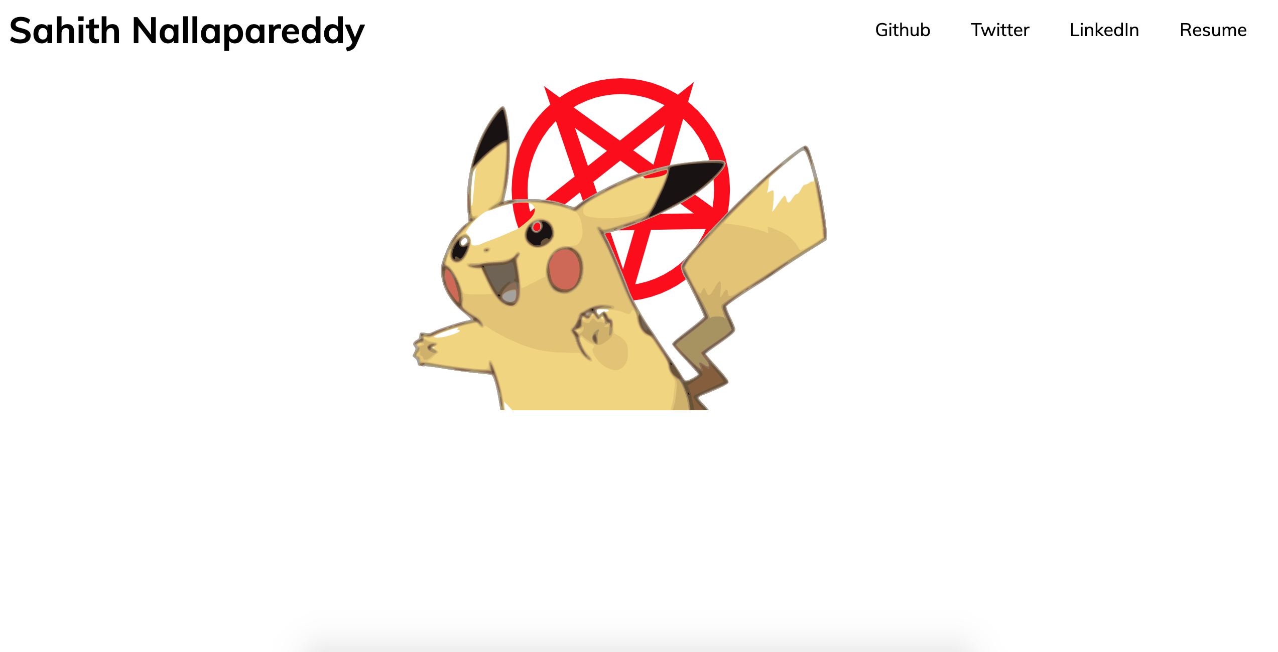
I think the way this ended up in the final dist bundle was... not ideal. I am a bit unclear what exactly happened, but I do know some of those SVG are actually quite large. The My Beautiful Dark Twisted Fantasy one was hand crafted with a loooot of shapes (especially on the face). Therefore, when I pushed this to Netlify (how I host this website) what I ended up getting on most reloads was this:

The svg just mixed together. Sometimes it would load correctly, especially when they were cached, but that was not the norm unfortunately. I may revisit the idea later, but I decided to scrap it for now. I guess they were just too complex!
Final result
From there, I decided it was time to just focus on the goals, which was to actually create the blog and a post. Well, I guess it's done! Gatsby made it easy as they had plenty of documentation on how this could be done. With GraphQL, the posts can be written in markdown and then loaded into a template, making it much easier to type and format. Overall, I am satisfied with the end product. There is not much to it, but it is something I created and finally putting my work out into the world. I plan to write more posts retroactively talking about other experiences I had. I have some small ones in mind ready for three.js project and maybe even a stupid Raspberry Pi post. I also plan on putting small things I write/draw in my spurs of late night inspiration and maybe even some music stuff as well. I also want to make a small posts about joining Spotify full time! At the end of the day this is for me, and I would like to keep it that way.