The making of my first app
A lot of my early programming experience is in mobile app creation, especially on Android. This was in part because I had internships at that time working on Android apps. One day I had an idea I wanted to create and decided to pursue it further than I normally do.
The Problem
This was in September of 2016, the first month of freshman year college. At that time, I was using a Samsung Galaxy S6 Edge. I thought the curved display was cool and so I bought the phone a couple of months prior. One feature of this was that it had was the Apps edge:
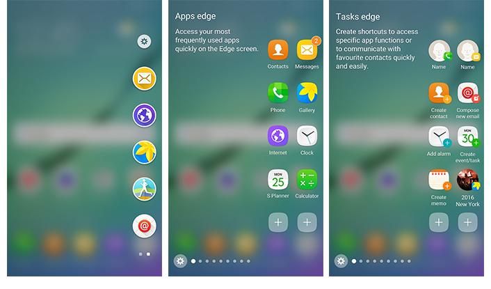
I actually enjoyed this as it gave quick toggles to opening apps, messages, and bookmarks. Well, not really the latter. While they did have a built in one edge app to open websites, it only opened in the Samsung browser and not the default browser on the phone. Since this was still a new phone, the app store was still pretty empty for this type of content. This is where I saw my opportunity.
BookmarksEdge App
I found out soon after that Samsung did have an edge sdk that you could use to develop an edge app. That's when I knew I could create my own bookmarks app that did open in the default browser like Chrome. At the time when I was doing this, the documentation was pretty rough. I mostly just had to follow the example and try to guess what I was doing wrong. Since then, it has definitely improved but I remember struggling hard for some time because this was a new problem space (google or stack overflow could not help with anything related to the Samsung API parts). However, I was finally able to create something that worked and tested on my local device. It was actually pretty ugly but it did work. This is what the first versions of the app looked like:
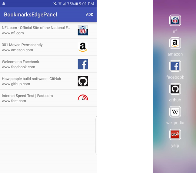
The icons were the favicons loaded from each bookmark and the title tags were scraped off the website. In this version, there was a maximum of 6 bookmarks a user could add and these were saved on the device. It was relatively simple and when you clicked on the edge part it would open the default browser to open that url.
Release
Usually when I create something I do not bother in releasing it. Either I do not want to spend more time on it or I made it just for myself so after some time I just abandon the project. However, this time around I decided to go completely through the process of releasing the app. I never done this before and I did not realize all the steps required to do so. I realize that I needed a name, icon, screenshots, splash images, and a description. It was a much longer process than I imagined. I created these in almost the laziest way possible as I used some online tools to create an icon with a B on it. None of these came together to look particularly great, but I decided to prioritize releasing over all.
![]()
I first released the app on September 16th 2016. I was fully expecting that it would be kind of hidden and maybe a couple of downloads but nothing too serious, especially with my app name and icons being pretty unappealing. I was probably just going to move on with my life and forget about it kind of quickly. I was very wrong. In about the first week, I received 10,000 downloads and from there was averaging between 700-1,000 downloads a day for about 2 months after. While I was somewhat excited that people wanted to use the app, I was also kind of scared as I knew this was not the best I could have created. I had a certain vision of what it could be and I was not close to that. In the current state, it was cumbersome to use, there were definite bugs that I may not have seen yet, and it was kind of hard to look at. Knowing that real people were using it and probably have higher expectations, I was scared at the feedback I was going to get. That is why I decided I had to start updating and maintaining the app as well.
Life as a maintainer
In the first couple of weeks, I received numerous reviews that were really helpful to see what I should prioritize. Sure there were some reviews that just said "doesn't work" or "nothing loads", but there were others that gave meaningful feedback. For example, some users wanted more customizable icons and the ability to add more bookmarks. These were very concrete ideas that I could implement and so these were the first that I tried to tackle. However, I realized that I needed much more insight into this creation. I needed to know if users were seeing crashes and wanted to able to track basic statistics like daily active users. From past experience, this lead me to use Fabric.io, which is now part of Google Firebase, to start tracking crashes, growth in active users, and churn. This was in important step as even today I can look at these metrics to see how the app has been doing without waiting for any user feedback. This was extremely useful going forward to be able to understand at least in small the behavior of users and how much use I was actually providing in value.
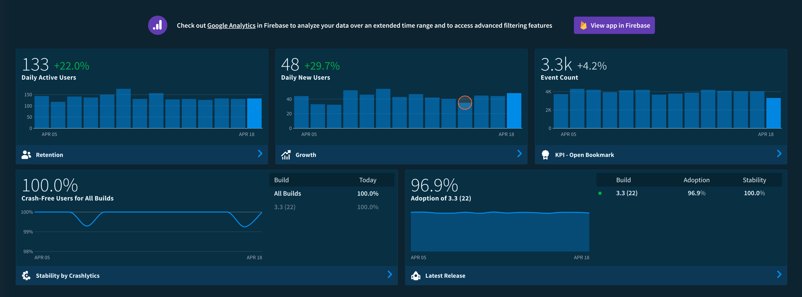
In the first 6 months of the app's life, I was maintaining a decent amount and responded to a lot of customer reviews. I was on top of all the problems and released somewhat regularly. However, I was only one person and it was becoming less possible to give so much time to this. From then on, I would have months of silence before having spikes of motivation and ideas to change. For the next four years, that trend would continue which also meant my downloads kept dropping, which was honestly pretty normal for an app of this nature (especially one not being maintained anymore).
Regrets
I think in any project, early decisions need to more carefully considered as they could really have a profound effect later on. This could be from design choices and implementation or just from a managerial perspective. Well in my case, there were a whole lot of mistakes I made early on that could have been avoided with some thought and more research.
Android Persistent Storage
One key component of the app is that you can create and save bookmarks. In my initial version, these bookmarks were saved in a file because that was the easiest way to do it. From what I read online, you could use a database if necessary, but I thought for six bookmarks a file would be more than fine. This decision in itself was not costly. What actually hurt was the format of saving it in a file. The bookmarks were represented as a Java object. Without putting a lot of thought into it, I thought maybe I can just put all the fields I needed into the file separated by a delimiter or something along those lines. This is a pretty bad way of doing it, especially if I am storing strings (like bookmark urls) that could contain the delimiter itself. But okay, I realize quickly this had to be improved but changing it now is not so easy. If a user is running version 1.0 of the app, and in version 1.1 I change how bookmarks are read and saved, these versions are fundamentally incompatible. If I update the app with just a new system of read/write, all these 1.0 users would lose their bookmarks unless version 1.1 handled version 1.0 bookmarks. This is backwards compatibility issue and will be a problem anytime I change how to read/write bookmarks to a file. This took me a long time to try to handle because in the worse case scenario, a user would lose their bookmarks in the update process, which is a frustrating experience. This is why in the first version I should have been much more careful in my decision. If I chose a format that was more forward thinking, I would not have run into these issues. However, in my rush to release, I did not think enough about it and had to pay the price in future iterations. For example, JSON is a much better format for this and would be much easier in handling backwards compatibility.
Ad revenue
The app was free to use for everyone. I never wanted to charge money for this because it did not really do all that much. It was a utility app and I thought it should be free. However, maintaining the app took time from my own life and getting money for that would have been ideal. I decided to implement Google AdMob banner on one of the screens. Nothing invasive that would halt the user experience, it was just a banner on the bottom of the screen. This was really nice as over the years I have gained a decent amount of money from that banner. My only regret is that I also missed out on maybe double to triple the amount of money I could have made. This is because after 6 months on the app store, my app had more than 100,000 downloads. Since then after 3 and a half years, I have had less than 100,000 downloads! The first few months I saw exponential growth, but once it steadied out I never saw that kind of growth again. I lost out on a lot of revenue by waiting to put ads in.
The Final Product
The app went through a decent amount of changes. I would not say I ever reached the maximum vision of where I thought it could be, but it is in a good place now. However, I decided that it was time for me to stop maintaining the app permanently. It has been one full year without me doing any meaningful work on it and at this point in time, I am sunsetting any development. It was a nice run and I learned a lot from this experience. I have reached 200,000 downloads recently and never thought I would have gotten that level of exposure. The final product:
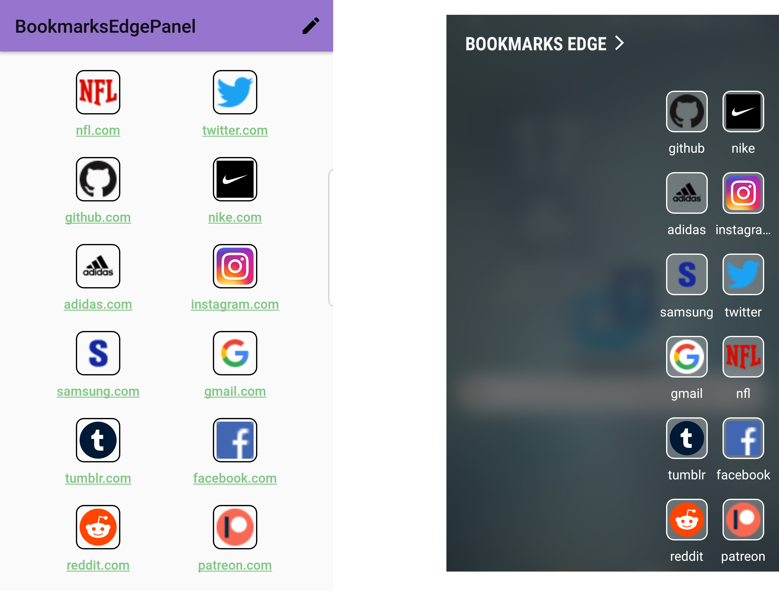
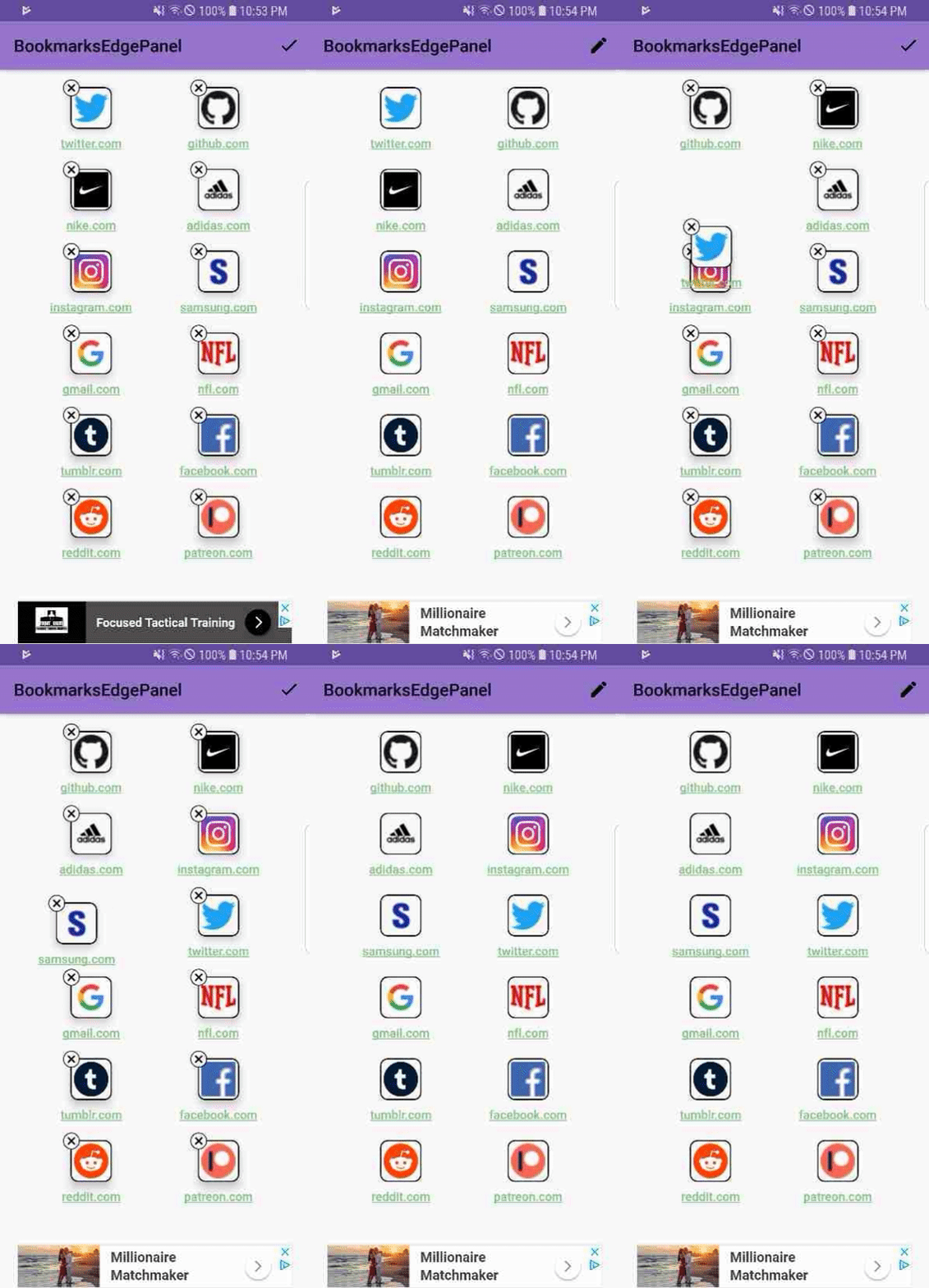
I was able to raise the number of bookmarks, make the UI much easier to use with drag to reorder, and finally implementing key metrics in Fabric so I can track key events in the app (like creation of bookmarks, deletion, edit, and opening a bookmark). The favicons are much cleaner and more customizable. As of now, I still get around 800 active daily users who use the app to open bookmarks and 3,500 bookmarks opened daily. I guess it is still providing use even if I have not done any development at all. I wish this could have been the first version of what I created, as there are a lot of better choices made and a much cleaner implementation. Either way, it was a fun ride and it was nice working on this when I had the time.